Making handouts easy to read
Most health education materials intended for children or their parents are written at too high a reading level. This review will help pediatricians choose and create handouts that get their message across.
Making handouts easy to read
By Tara F. McComb, RN, PhD, Margaret M. Duffy, RN, EdD, and Ingrid P. Pearson, MS, CPNP
Most health education materials intended for children or their parents are written at too high a reading level. This review will help you choose and create handouts that get your message across.
How difficult a written text is to read and comprehend defines its readability, according to the National Institutes of Health. To understand most of the patient education materials related to perinatal and pediatric health now in use, parents must read at a 10th or 12th grade level.16 This is significantly higher than the accepted standard for health education materials.1 Materials are best read and comprehended when they are written at lower than a fifth grade level.
Most of us can readily understand this concept by assessing our own response to written instructions for using a computer program or assembling a piece of equipment. If the instructions are written in the language of the computer expert or the mechanic, they can be significantly harder to comprehend and follow than instructions that don't use technical lingo. When the directions are written in simple, short sentences, perhaps accompanied by pictures or diagrams they are not only easy to understand but may actually be enjoyable to read. The same principles apply to medical information that clinicians distribute to patients who have no medical training.
When we write instructions for patients and parents by hand, we do not use long paragraphs or difficult words, or try to define everything we have said to them. Most of us write short, easy-to-follow directions. When we start to formalize this information on a computer, however, we often feel compelled to elaborate. We write more and end up making the material difficult to read.
Where to get handouts
Many Web sites offer easy-to-read medical information. These materials are useful as handouts and also can serve as models for handouts you develop yourself. "Patient information on chickenpox?" is an example of this type of material.

Medical University of South Carolina's Clinical and Patient Education (www.musc.edu/medcenter/education/cpeducation/). All of this site's educational information has been tested by Prose, a computer software program for evaluating readability, and reading grade levels are noted in the margins.
The National Center for Farm Worker Health (www.ncfh.org/resources/pateduc/pateduc.html). Low literacy material can be downloaded from the site.
Other sources of easy-to-read health information are the National Cancer Institute (Easy to Read Publications, 800-422-6237) and New York On Line Access to Health (NOAH; www.noah.cuny.edu/). Patient education materials in Spanish are available from the Medical University of South Carolina, the National Center for Farm Workers' Health, and New York On Line Access to Health.
How to do it
Writing and design work together to determine the readability of patient education materials.
Aim for clarity. Using short, common, and nontechnical words, learned early in life, lowers reading level. Try "pills" instead of "medication," "eat" rather than "consume," and "make" in place of "produce." Words of Anglo-Saxon origin that have a common, concrete meaning are usually best. Edward Fry's One Thousand Instant Words: The Most Common Words for Teaching Reading, Writing, and Spelling is helpful.7 If you must resort to medical terminology, include definitions in parentheses or a glossary and use only commonly understood abbreviations.
Keep sentences shortno more than eight to 10 words. Use the active voice: "Take these pills every day" is clearer than "These pills should be taken every day." Try for short paragraphs that present one idea or issue. Use examples to clarify new or unfamiliar concepts. "From 12th grade to sixth grade: An example" shows how to simplify material that is at too high a level.

Use colors carefully. Black printing on white paper generally is effective and economical. White printing on a black background, on the other hand, slows the reader down. Colored ink can be effective if used sparingly and for a clear purpose, but remember that some people are colorblind. The primary colors, red, blue, and yellow, appeal to children, while adolescents are partial to secondary colors. Warm colors such as red, yellow, and orange are more easily read by older people than the cooler colors, such as violet, blue, and dark green. Glossy paper stock is not a good choice for handouts because it reflects light, makes print more difficult to read with glasses, and can be difficult to write on.
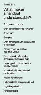
Choose a good design. Use a type size between 10 and 14 points. Larger type is appropriate for the elderly and the visually impaired. Use upper case letters to start sentences and proper names, but don't write in full caps. Long blocks of copy set in capital letters are difficult to read and slow reading speed. Judicious use of white space and a ragged or uneven right margin rather than justified margins add to readability. Ragged right margins also help keep production costs down because corrections are easy to make. Place graphics next to the related ideas in the text. Make sure illustrations are accurately drawn and appear in the correct sequence. Instructions on how to give an insulin injection, for example, should show the actions in the order the patient would perform them. Organize the material in a logical way with important information placed first or last, since readers have a tendency to skip over information in the middle.8 Patients are less likely to throw away educational materials that have their names on them, so leave a place on the cover for the name. Table 1 summarizes what makes educational materials easy to understand.

Assessing the finished product
The readability of handouts can be determined in several ways. Descriptions of these methods are available from several sources, but the best single source we have found is Teaching Patients with Low Literacy Skills.9 The authors describe how to apply SMOG, a readability formula recommended by the National Cancer Institute, to written material, and give guidelines for presenting material in other formats such as audiotapes, which may be necessary when literacy skills are minimal or nonexistent. Other readability formulas are discussed in a journal article available in most libraries.10
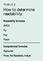
Readability can be measured by manually applying a readability formula, but using a computerized program is faster and easier (Table 2). It also is more reliable than the manual method because the computer program can apply several different formulas simultaneously. Rightwriter and Prose, the Readability Analyst, are useful software programs for evaluating readability. Another advantage to such programs is that they can scan an entire article or booklet; using a manual program, one is likely to evaluate just a portion of the text. Determination of the readability level can differ by as much as two grade levels when the evaluation covers just part of the text.

Using Prose, the readability score for this article is 14.84, the 15th grade levelappropriate for a student in the junior year of college. In testing the material, Prose uses eight different readability formulas, including Fry, Fog, Flesch, and SMOG, and averages the results. To verify the reading level of an article or handout, it's best to test the material on your intended audience, not on other health professionals or peers.
Wrapping it up
Patient education materials are often written at an inappropriately high reading level. Patient handouts should be short and clear. They should include only important information and use examples whenever possible. By following these guidelines, pediatricians can evaluate the educational materials they are using and develop handouts at appropriate reading levels for children and their parents.
References
1. Albright J, de Guzman C, Acebo P, et al: Readability of patient education materials: Implications for clinical practice. Appl Nurs Research 1996;9(3)139
2. Klingbeil C, Speece MW, Schubiner H: Readability of pediatric patient education materials. Clin Pediatrics 1995;34(2);96
3. Melman ST, Kaplan M, Caloustian ML, et al: Readability of the childhood immunization information forms. Arch Pediatr Adolesc Med 1994;148(6):642
4. Spadero DC: Assessing readability of patient information materials. Pediatric Nursing 1983;180(4)274
5. Wells JA, Ruscavage D, Parker B, et al: Literacy of women attending family planning clinics in Virginia and reading levels of brochures for HIV prevention. Family Planning Perspectives. 1994;26(3):113,131
6. Williams-Deane M, Potter LS: Current oral contraceptive use instructions: An analysis of patient package inserts. Family Plann Perspectives 1992;24(3):111
7. Fry E: One Thousand Instant Words: The Most Common Words for Teaching Reading,Writing, and Spelling. Westminister, CA, Teacher Created Materials Inc., 1994.
8. North G, Margree G, Roe M: Guidelines for producing patient information literature. Nurs Standard 1996; 10(47):46
9. Doak CC, Doak LD, Root JH: Teaching Patients with Low Literacy Skills, ed 2. Philadelphia, PA, Lippincott,1996
10. Spadaro DC, Robinson LA, Smith LT: Assessing readability of patient information materials. Am J Hosp Pharm 1980;37(2):215
DR. McCOMB is Assistant Professor, College of Nursing, and Investigator, Center for Health Care Research, Medical University of South Carolina, Charleston, SC.
DR. DUFFY is Clinical Educator, Clinical and Patient Education, at the same institution.
MS. PEARSON is Assistant Professor, College of Nursing, at the same institution.
Tara McComb,Margaret Duffy,Ingrid Pearson. Making handouts easy to read. Contemporary Pediatrics 2000;4:145.
Having "the talk" with teen patients
June 17th 2022A visit with a pediatric clinician is an ideal time to ensure that a teenager knows the correct information, has the opportunity to make certain contraceptive choices, and instill the knowledge that the pediatric office is a safe place to come for help.
Artificial intelligence improves congenital heart defect detection on prenatal ultrasounds
January 31st 2025AI-assisted software improves clinicians' detection of congenital heart defects in prenatal ultrasounds, enhancing accuracy, confidence, and speed, according to a study presented at SMFM's Annual Pregnancy Meeting.